StubHub Search Redesign
4-week sprint.
STUBHUB SEARCH REDESIGN FOR 2017, ADDING KEY SORTING OPTIONS VIA TOP NAV / LEFT RAIL.
1 MONTH PROJECT, DECEMBER 2016.
Week 1 - Defining the Problem
Product management came to the design team with a desire to redo search results on StubHub.com. For over a year, this aspect of the site hadn't been touched.
Our current page, as of December 2016, gave the ticket buyer very little in terms of customizable filters and sorting options. Basically, we plopped them down on a list of tickets with no way to reorganize the page.
The product managers had metrics demonstrating that there was high dropout from search results. And calls with customers proved this was at least in part due to the inability to filter and refine.
The "before" screen. I search for Giants, get a laundry list of ticket options. StubHub guesses I want the SF Giants because I'm logged in, and organizes by date as the only state.
Business Needs
After a kickoff with the business, I defined their needs in a project brief:
"Customers aren't following through on purchasing when searching on StubHub.
We're getting more ticket sales from Google search than our own search. Our search results are not converting."
Customer Needs
I read through current data and surveys with customers. My view on what our buyers wanted changed as the project continued, but my initial summary was:
"I don't always see what I'm looking for when I search for tickets on StubHub. There's no way to refine and get more accurate results.
That makes me want to try another, better organized site."
Week 2 - Competitive Analysis
I looked at four competitors and took notes on the buying choices in search results for each.
Cheaptickets used a content rich results page that gave background on the tickets you were buying in mini-articles.
Eventbrite had a map view on search results, as well as a helpful short-list of filter: event type, date, and price. There was also a "category" filter, but I didn't see a lot of application for this. Images were used erratically and inconsistently.
Seatgeek looked the most like StubHub's results. Tickets were organized by date as a default, without much in the way of filtering.
Ticketmaster's left rail treatment would prove to be popular with the product management at StubHub. Ultimately this would heavily influence our redesign.
Solution Statement
Provide useful filters and other key info on StubHub's search results to help buyers get to the right ticket.
Potential contextual information to add based on competitive analysis:
Event Date
Seat Selection
Price
Delivery Method
Location
Event Description
Week 3 - Wireframing & Usability
I created four options for my product manager to review, each with their benefits and drawbacks.
Option 1 used a tabbed treatment to distinguish between different filters: ticket price, date of the event, and delivery method. During my initial wireframing, I considered: what if people were looking to take a group to an event, and wanted to sort by the # of tickets we had available?
Option 2 added filters using an icon treatment. I wanted to test this option with a text map of venue seats - giving the ability to find seats by section (since a full seat map was not part of the scope for search).
In Option 3, I created a left rail treatment with most filtering done in this space, though I did add a Ticketmaster-esque "related searches" at the top.
The final option was the most complex. I wanted to test and see how customers would handle the maximum allowable filtering within the small space of search. I added a two-tiered system of buying options with a couple of original options like "best seats" (seats with the best view) and "hot items" (tickets going the fastest).
User Testing
We conducted a study involving 12 customers over the course of 2 days. These customers were mostly what we called "power" buyers and sellers - people who sold or purchased tickets weekly on StubHub. I took away several key learnings:
Customers cared about seat selection, including which seats were marked the “best” or most popular.
They also cared about being able to filter by location and date, just as the product management team suspected and supported by competitive analysis.
Surprisingly, delivery method wasn’t a priority. We thought people would be more attracted to the ability to find instant downloads (versus by-mail tickets).
The left rail treatment was considered the most accessible and easy to use. When we asked why, many customers cited non-competitor sites that they were used to, such as Amazon.com.
Week 4: Iteration
Generally users preferred the 2nd & 3rd options the most, so I decided to narrow down to these two and refined each. I presented both to the design and product team in a formal design review and let them decide which one to go with.
Option 2, refined. Seat selection was changed to emphasize best values and choice seats, and ticket delivery method was eliminated based on user feedback.
The left rail treatment, revised with similar features.
Ultimately, the team and I agreed that the left rail was the best way to go, with the top "related searches" added in as a contextual secondary feature.
Each of the two final options had a similar usability score, but the left rail seemed more recognizable as filtering because of other popular sites that use this method.
Next Steps
I held a post-mortem with product management and design, and walked away with a few next steps. If my contract was longer with StubHub, I'd be eager to take these on today:
- Additional usability around delivery method filter: what if the content was tweaked to be clearer about the differences between by-mail, pick-up and download tickets?
- Seat selection - any way to integrate the popular option of choosing seats by section, and not just by value / popularity?
- Pursue the option of adding a venue map and event description without using too much real estate and cluttering search results.
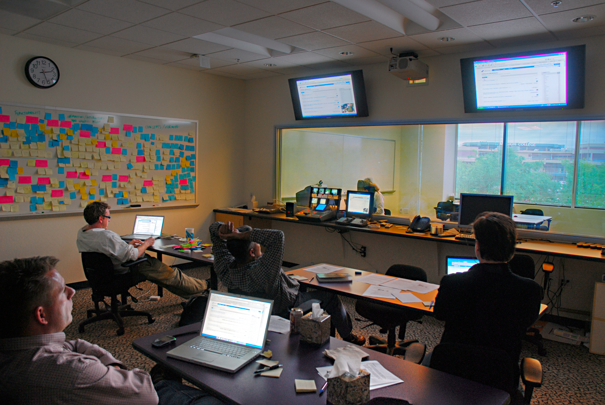
Design Process
The Search Redesign was seen as a model project in terms of cooperation between the different teams, from PMs to UX to research and the development team.
As a result, I developed in Sketch a handy project management tool for UX projects at StubHub, the first of its kind. This diagram is still being used today to move projects through their life cycles.